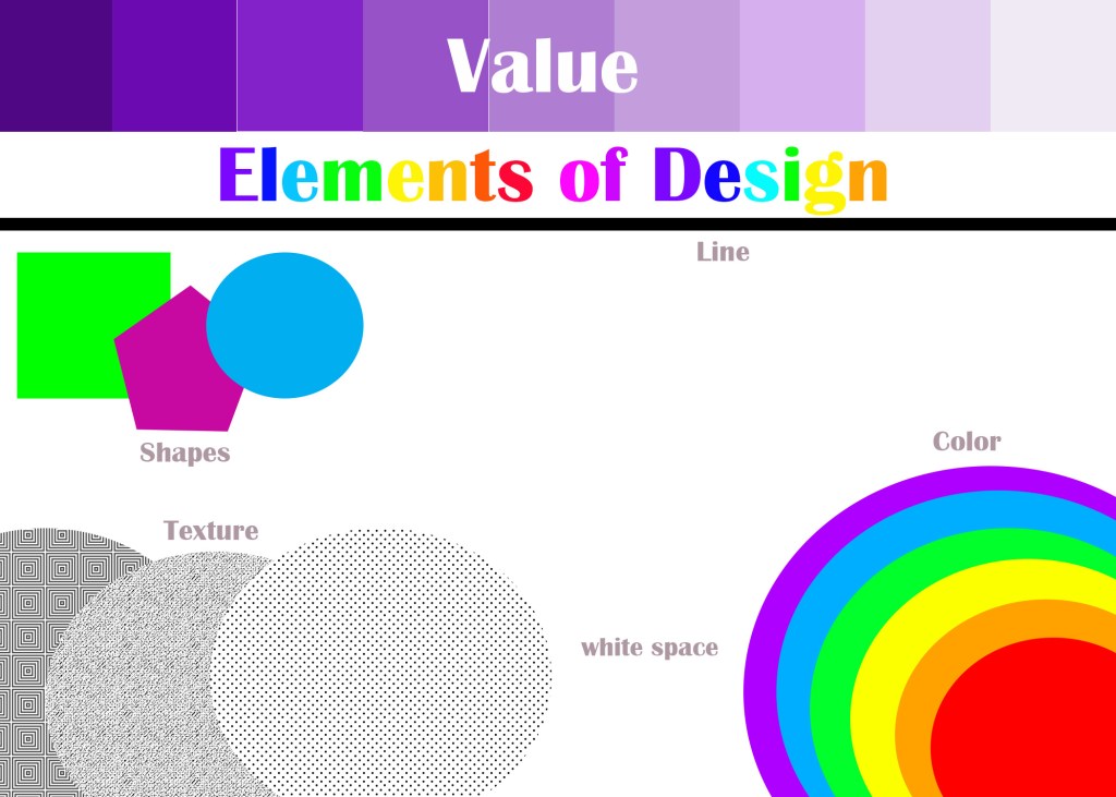
This is my image of the Elements of Design Project. By using my creativity, I started doing the title first in different font and with each letter having it’s own individual color. With the shapes and the line, I did the circle, pentagon, the square with its own color, and the line in black. I wanted the line to be under the shapes so it will be more refined and accurate.
For value, I made 9 squares in purple from dark to light, making every square the same size and shape, and fully covering the space on the upper area of the blank image. I made the word, “Value” white so it’s conspicuous and easily read. Doing color, I did the circles for the rainbow. I wanted to have the purple at the very bottom and red at the very top, but the circles were automatically overlapping, which was not what I wanted and there’s was nothing I could do about it, so I the rainbow with the red at the bottom and purple at top. I made sure they were the right size to fill enough space around the bottom-right corner. I did all the others and put the word texts near to identify them.
Here is my image of the “About Me” project. I was having to create this type of image because I find it a lot easier into getting it done without any trouble, by placing the images around and my name in the center, and some of them overlapping one another. It look me a little time finding the images for this project, because at some point I had to search the images with “jpg” on google, and not all of them can be put into Photoshop. But I did find pictures that I’m looking for.
I was born in Tokyo, my birthday is 10/9. I have my only younger sister, I live with my Daddy and Mummy. My hobbies are art, music, watching anime, reading books and manga (Japanese comics), watching youtube videos, and swinging. My favorite music is Japanese mostly, but I also like Jazz music and others as well. My favorite color is blue, my favorite candy is Hi-chew (Japanese), and my favorite food is udon (Japanese thick noodles).
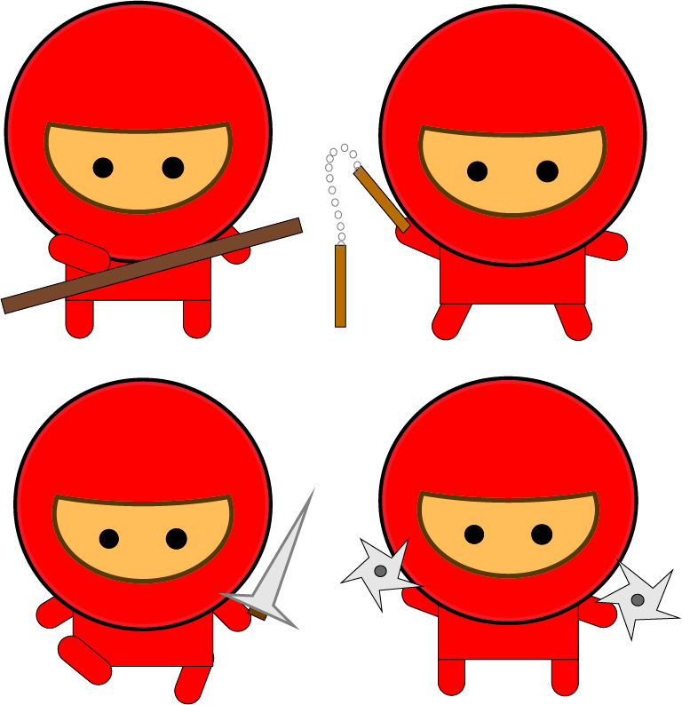
This is my project of creating a Gang of Ninjas. At the very start, pretty much everything was easy to do, I had to create different shapes for my ninja. I pressed “Object menu -> Arrange -> move to back” whenever I needed to move the shapes behind the other shapes, just like putting the legs and arms behind the body.
The part of creating the mask was pretty hard and confusing, except making a larger oval and the circle, overlapping the two and using the Align Palette to position exactly. Using the Pathfinder palette and making sure that the mask and the face was the hard part, so I asked help from my friend. I made the eyes within the large circle of the ninja, drawing a small circle and filling in it with black, and making another copy. Once that’s all done, I grouped all the parts of the ninja’s body.
Drawing a selection around the complete object, copying and pasting a duplicate was also the hard part. It was when I had to create a stroke for the head and the body of the ninja. I selected the Appearance mode in order to create the stroke, aligning to the outside of the head at 4 pt at 100% black said in the instructions. My friend, helping me, said I could choose any pt that was right for me. I also had to create the stroke for the inside too, but in a different color. I selected a new stroke, 4 pt colored in red but a little lighter then regular. The another thing that was hard was creating a stroke for my ninja’s skin tone. In this step, I fill the color of the skin tone whatever I wanted, add a slightly thinner stroke at 3 pt aligned to outside using the 90% red, and another stroke for the inside of the facial area, slightly a darker color. Like other strokes on the previous steps, it doesn’t really matter that I should choose pt exactly said on the instructions, whatever I do is right for me.
Once I finished the basic version of creating my ninja, I copy & pasted my multiple variations of my character. I had to create different poses of the other ninjas, so I ungrouped one of the ninjas arms and legs, changing them into different positions to make the exact different poses on the instructions. When finished, I put them in four different positions.
I also had to create the weapons for each of the ninjas as well. I created a long thin rectangle, colored in dark brown, for the stick. I used the star shape tool for the throwing weapons. Clicking on the star, I moved the points into different directions to make the weapon look accurate and the solid circle in center. For the sword, I used the pen tool instead to create prefect triangular shape for the blade, and a three-sided shape to represent the chamfer. The two Numchuk handles part was the hardest until I found out I forgot to click “Object > Blend > Make”. I grouped all of the weapons except for the stick. I adjusted the sizes whenever I needed.
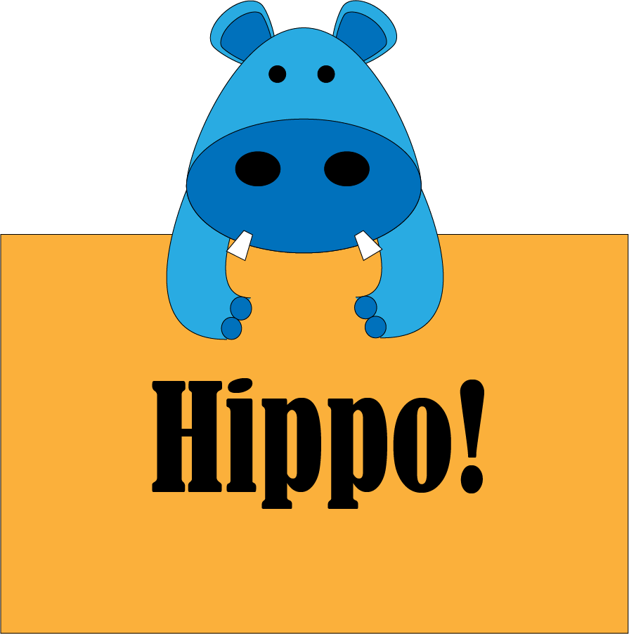
At the very beginning of the project, I kind of struggled a bit because I wasn’t so sure what tools I needed to use to create the head of the Hippo. So I watched the video, and figured out that the Ellipse Tool is the tool I needed to create the head and the ears for the hippo. When doing the ears, I struggled putting the ears together (Inside & Outside) because I didn’t know “Object menu -> group” is what should select in to put them together. When putting the ears on the Hippo’s head, I select “Object -> arrange -> send to back” in order for the ears, the bottom area, to not be noticeable on the head. Then I used the Ellipse Tool in to draw the eyes and the nose, coloring all the circles in black. For the teeth, I had a little trouble doing the tooth, because it was kind of hard to change the lines into different angles. Asking a friend, she suggested to use a pen tool instead to draw the rectangle shape I wanted. To get another copy, but in a reflected shape, I selected “Object -> transform -> reflect”. I put the teeth in the correct spot. Next, I created the arms using the pen tool. Doing the curves wasn’t the easiest thing to do, so whenever I made mistakes, I pressed Ctrl+Z to start again. I also did the tools to draw the toes as well, I make sure the arms were neat and accurate, and clicking “Object -> Group” to put the arms and the toes together. I made another copy, and I neatly put it under the Hippo’s face. Like I did with the ears, I selected “Object -> arrange -> send to back”. Once that’s all done I did the rectangular shape behind the hippo. I added, I text “Hippo” for the font just right for me.
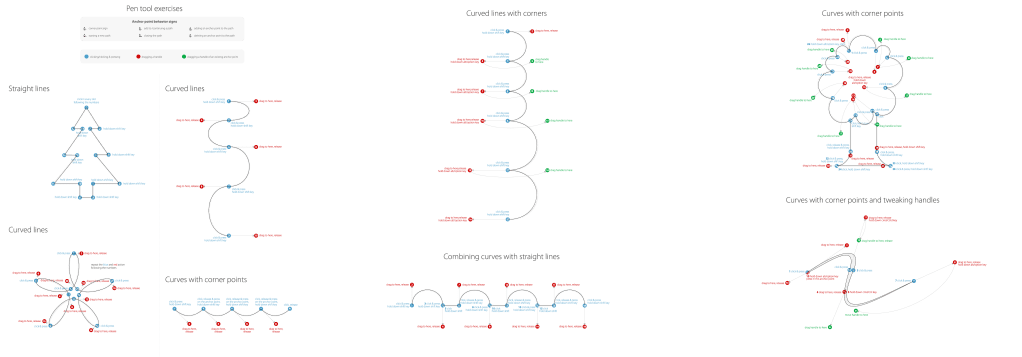
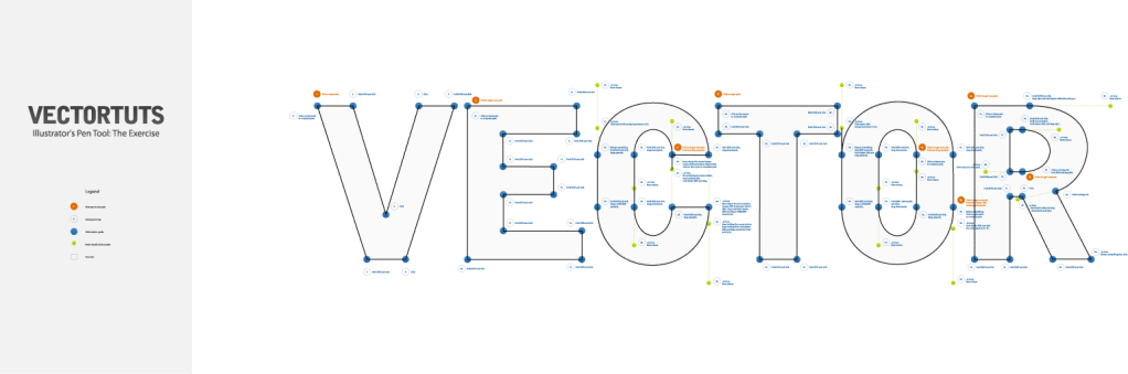
On the Pen Tool Exercises, everything was pretty much easy for me, doing the project and watching the video for instructions at the same time. All I had to do was to practice tracing the gray lines using the pen tool, beginning from starting point and finishing at the ending point. But before that, I needed to make sure the color fill on illustrator is not solid, because if it was, and I traced from one to the other, I notice that the color, no matter what it is, blocks the directions and the other lines. With that, it hard to see the other directions and the lines. So after doing that, I could trace the lines, whatever color it is, in the correct order. While tracing the lines in the correct order, there some words or sentences, for example, “hold the shift key”, on the some of the points. Which means I have to hold or press the shift key, in order for the line to be at the right angle on the tracing line. I also had to press/hold the other keys as well, depending on what section I’m on, tracing the lines. Whether it’s curved, straight, or can be any direction. If the line doesn’t end from all the way back at the beginning, I press the “Esc” key to get out of it. Whenever I got stuck, I asked my friend for some help.
I worked this project at home. I had some struggles when getting started on the project, because I wasn’t sure if I can work it at home without at hand, and it kinda made me felt worn out. But when I finally figured it out when I read and followed the instructions carefully, I did quite alright, although some of the instructions was a little confusing to understand, so I asked my Dad for any help if necessary. When doing the timeline section on my project, my Dad said I always need to PAY ATTENTION TO DETAILS, when finding some things that may not be as conspicuous as it looks. I usually stay focused on my eyes on looking the entire thing, but I finished the project just fine. Although, I was confused on how to upload the image on my Mac book, because I thought I didn’t save it correctly. But because I did it, and more importantly, I figured it out, so here’s my image.
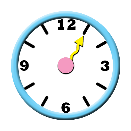
I didn’t have much struggles in this project, but I had a some struggles at the very start. When getting started , I found that there was no “transparent” in “Background Contents”, so I selected “White” instead, and named my project “Harley-Clock”. Later on, when doing the project and following along with the instructions, there was something wrong that happened when doing the project; I was trying to make the whole background transparent, while adding rulers & guides. I wasn’t sure what was wrong, but the person around suggested that I should start a new version of my project, I renamed it ” Harley-Clock-New”, so I won’t have any confusion when I come back another time to continue on my project. I followed the instructions as usual, and this time, I went quite alright. I didn’t have such problems, but when saving my project, I asked the person near for some help saving the project correctly, without having such problems to upload the image of clock like I just did. So here it is, and before uploading it, I make sure that the clock animation was in the Photoshop folder.
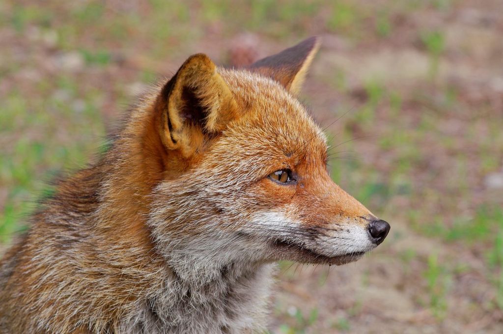
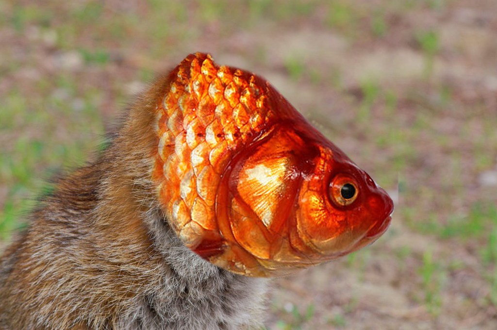
There’s my picture of My-Choice Impossible Creature. I mixed up the head of red fish and the body of a red fox. I like my own choice of this project, but when I was getting started I had difficulties of choosing the images of the fox and the fish. Because of this, I didn’t keep in mind about something important; about noticing that the animals were supposed to be in the right position of the direction their heads are facing. That was the reason why I had a pretty hard time getting my project started. When I got started and while doing my project, I also needed the Impossible Creature instructions to go over the stuff that I need help with so I don’t stuck. And at the end, after using the Clone Stamp tool to blend between the fox’s fur and the fishes body, I noticed an invisible line that when I tried to stamp the fur to the bottom of the fishes body, but it wouldn’t work so I decided it was time for me to move because I didn’t want to fall behind and spend to much on my project because there was no way of fix it. But I finished my work, so I’ll turn it in.
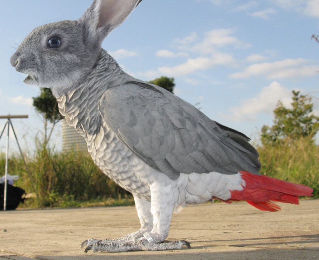
I found a little difficult doing this project because there were some things that were struggling and hard to work out with. I started out doing only the face first, after when I opened the instructions WITHOUT the pictures. After when Mr. Smith helped me to open the instructions WITH the pictures, and later on, I didn’t realize I needed to add the rabbit’s neck. This was the time when I was going to use “eraser tool” to make the image organized and erase the parts that overlap some areas. So I asked Mr. Smith for some help if I had any struggles. And a few days later, I needed the whiskers, which is the hardest part, because I needed help fixing the parts I needed. So once that was all done, I didn’t feel like I needed to add any more whiskers. And next time I start the project I was given to do so, I’ll ask the teacher for help if the instructions if it doesn’t have any pictures.