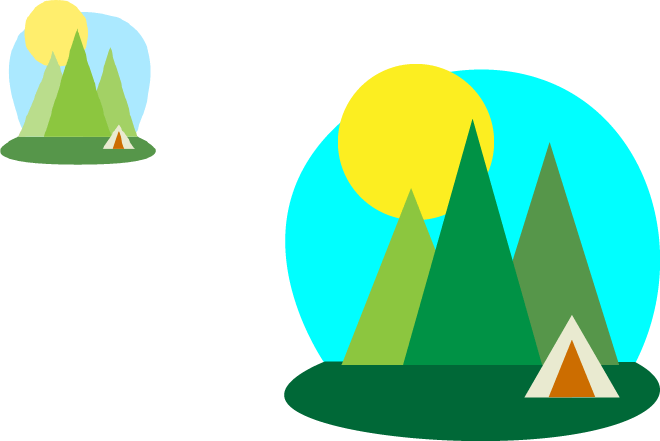
Here’s what my project looks like from Illustrator. I created a picture resembling the one on the top left, but as you can see the colors are different from it. I made it this way because I wanted the trees to be in a most accurate color. I didn’t want all the the trees to have a light green color. I also wanted the sky to look more like a circle (than the one that’s on the top-left).
This was project was like “Removing Distractions”. I used the Spot Healing Brush tool but from what I learned, Healing Brush tool is a little different – it takes the textures and using it, you can place it wherever you want (press Alt when clicking). If it shows no effect, then the Spot Healing Brush tool can be used. Until now, I’ve didn’t know you can combine the two layers into one. Say that I have two layers which that I used the Spot Healing Brush tool to hide remove blemishes on different parts of the skin. I press Ctrl + E to merge them, and if I click on the eye on the layer (which that turns the visibility on & off), I can see they can be turned on & off at the same time. Very Interesting! I’m happy with my work and I prefer using the Spot Healing Brush unless I really need to use the Healing Brush tool.
The easiest process of turning a Dark picture into a brighter one, and a Bright picture into not-too-bright picture. I just go to the icon one with a half circle and choose “Layers”. When I double-click on the layer, the Layer Style will appear on the Blending Options section to adjust the brightness and the shadows. Choosing the exact doesn’t matter, the way how you see the image is your option. The Darker image will be brighter showing the necessary details, while the bright image will have some shadows. This is just a demonstration of the difference between the two images of they will look when you use the Layers Style and adjust it. This is very useful because people will like it more if the image has the necessary details.
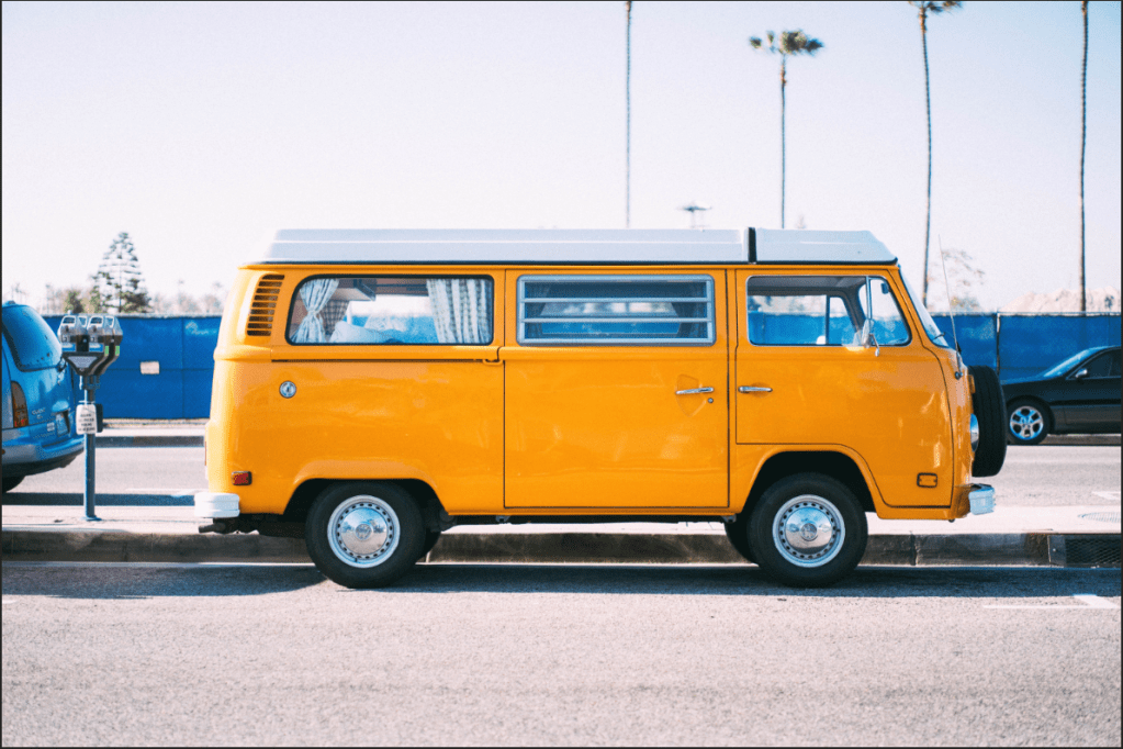
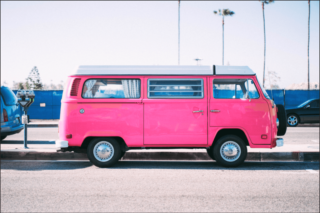
Another fundamental technique, but I got a little confused with working on the Eyedropper tool while I was following the instructor because knowing about how it’s used turned out to be a little different than I anticipated. I clicked on the background instead of the van to make things work. The Eyedropper is used for what hue (color) is affecting your object of the image. The bar between the colored lines (at the bottom eyedroppers) will be moved if you clicked with the Eyedropper. If you find the right color, move the “Hue” to change to what color you want on your van. The Bar may also be moved as well, but it’ll affect the colors of different objects too, so be careful while moving. The “Saturation” and the “Lightness” can be adjusted if you’d wish. If some aspects’ color of the background image changed, simple and easy – just use the paint brush tool and make them invisible.
Color Grading is a technique that is always good to use if any users want the picture to look more brighter and colorful. Just go to Layers>New Adjustment Layer>Levels and change to the color grading to how you want to see it fit. If users are unsure of how its going to change, don’t hesitate, just move it because it’s not going to damage it or anything. If the image looks odd, too bright or dark, you can adjust however you like – there are no limits to this. What a fundamental technique to learn in Photoshop. Happy Practicing!
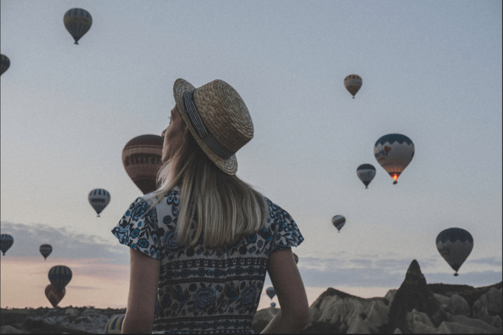
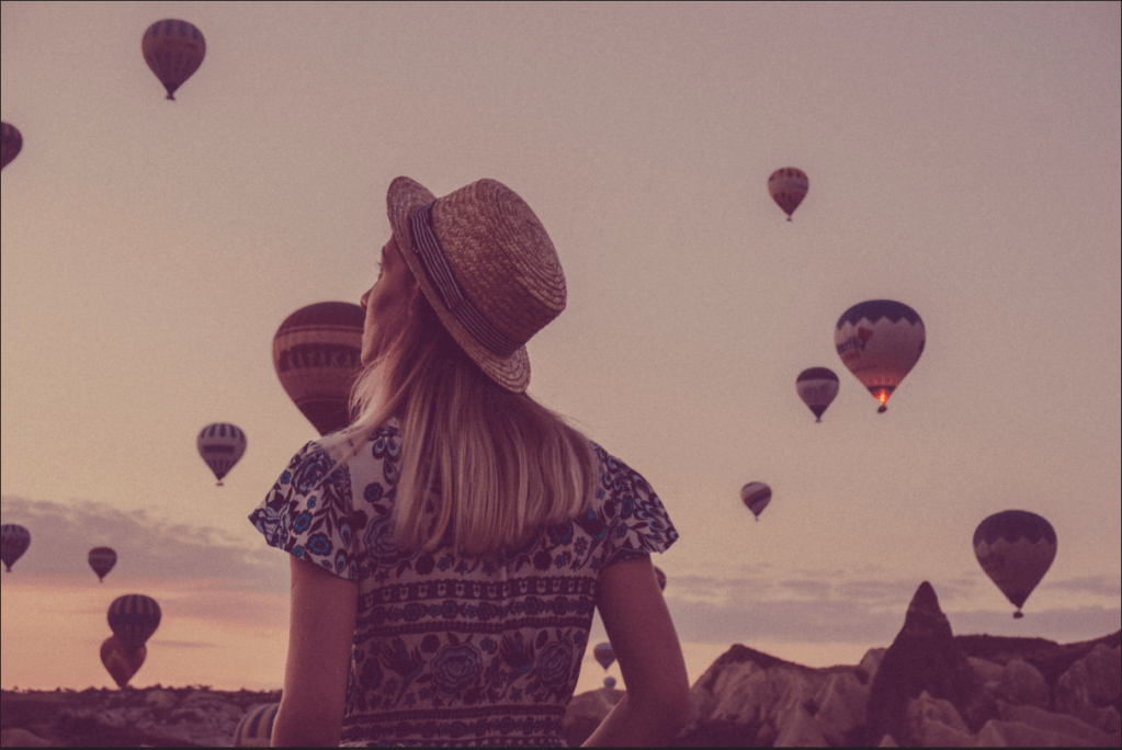
This method in Photoshop was stressful because I did not know how to start the project when I opened the RAW image. I watched the entire video first to understand what’s done in the project. I wanted to follow the instructor, but I now understand that how different the RAW is presented shows the different types of computers we use. Say, the one that I use is a PSD, the instructor uses is a MAC. What I mean is when the RAW image shows up, on the right side, there different layers in which are to change the quality of the image. The layers are in different names with no icons presented in the PSD computer, however, if it’s an apple or MAC computer, different icons are presented, and the names are just below them, not on the right side, but in the center. Despite knowing this, all the layers work out the out the same way in both computers. Anyway about the image – I used a higher quality version and as I followed the instructor, I played around with it a bit and made the image look a lot more saturated. It made it even more colorful and prettier which made me feel really happy. And a very important information – always make sure to check “Open in Photoshop as Smart Objects” so the results won’t be complicated and you can go back and change it you’d like. Just move the mouse and click on the link below.
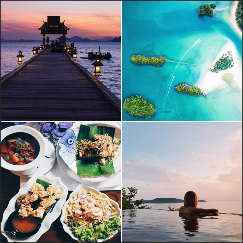
This was very similar to the “Non-Destructively with Smart Objects” project, except that it had 8 different pictures of different categories. I also had to create a white background and fill with black squares to allow the image to fit into it, so when I move it around, it’ll stay inside the square no matter I direction I go to, or even I resize it. I do this process by making into a smart object (right-click & click on “Convert to Smart Object”) at the start, placing the images into the background, and right-click to select “Create Clipping Mask”. In your layers panel, be sure to move under the layers, “Layer 1”, “Layer 1 copy”, so the photo collage will stay under the square backgrounds. It’s very important to add the smart object first because when you resize the image, so it won’t lose it’s resolution (to lose quality). I also used transform (Ctrl + T) and duplicated (Ctrl + J) the images and the white lines. I created a new layer and used the Rectangle Marquee tool, Shift + Backspace selected “white” under the layer for the white lines.
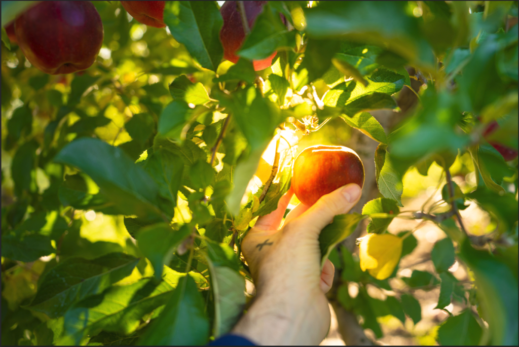
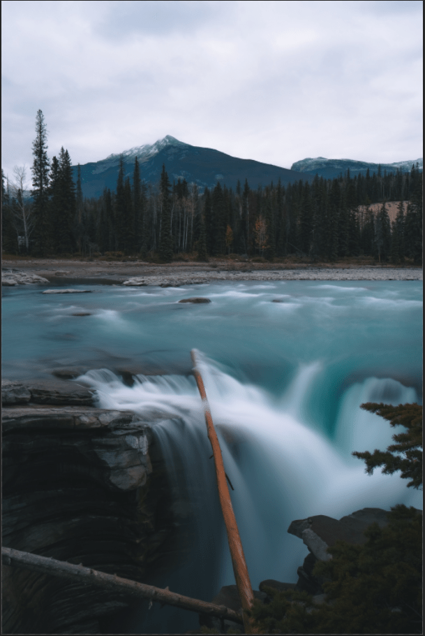
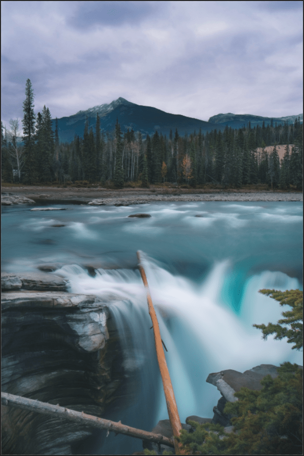
This project pretty much has the same as the previous ones, because it has the process of doing Ctrl + I to invert the layer masks and using the paint brush tool to lighten or darken the parts of the image. But there was somewhat a different process of lightening and darkening which is known as Dodge and Burn. In this process, I select the paint brush tool, and notice at the top of the screen, the Flow is at 5% and the smoothing is at 0. I make sure the colors are visible, which means the white is above the black (around the bottom of the Tool bar). As I paint the light the trees and the white parts of the waterfall, and darken the some parts of the rock, and turn off & on (eye on the left side of each layer), I find the picture look absolutely beautiful. The waterfall reminds me of the movie, Ice Age.
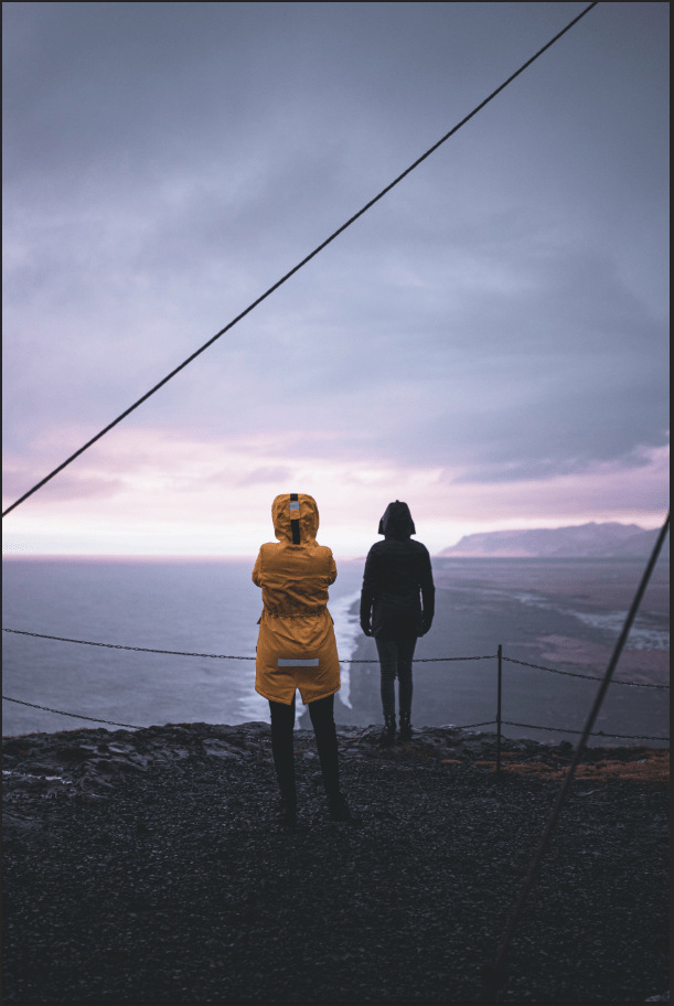
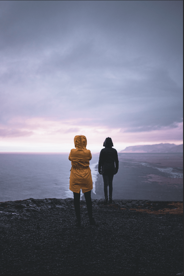
Several things I’ve learned from the project are the Spot Healing Brush tool and the Clone Stamp tool. The Spot Healing Brush tool is used for removing distractions, say, if there’s lines around the background image, I can use the Spot Healing Brush to get rid of them. The changes seem to look alright until you find out that parts of where you used the Spot Healing Brush tool don’t seem to look right. This is the time when the Clone Stamp tool is used. Hold the Alt key and click on around the parts of where you used the Spot Healing Brush tool, and click on which parts you want to be fixed. This is simple and self-explanatory, and if its finished, you can fix the others and move on if you wish. I also erased the gray parts (on the bottom & top part) of the yellow jacket of the person on the left, because I thought it was a little too odd. The background looks wonderful after all of the distractions are removed.
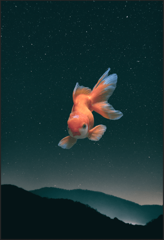
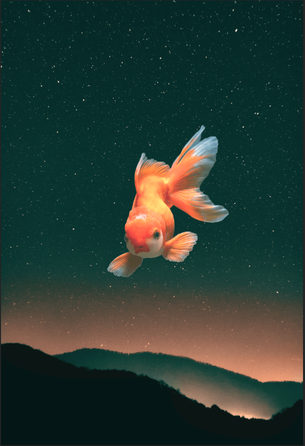
A very interesting project done in photoshop. I can add a single object like this in a background image using Blending Modes. I don’t have to memorize all of it, but its obvious that I can select any type to see how I want my image to see fit. But the most important part of it is knowing that whatever blending mode you choose is going to result in many different ways. For instance, the image with the fish visible and the background invisible, I can use “Lighten” or “Screen”, or if it’s the other way around, I can select “Darken” or “Multiply”. But if I liked to do coloring with the image, “Overlay” and “Softlight” would be selected. I used Screen mode for this project. There are some issues users can come across when using this, like mine had stars visible around the fish, so I used the Paint Brush tool to prevent it. Color Fill (Solid Color) is also usable if I wish to change the background to look brighter or darker. Blending mode can be used, but I try looking at each of them so I can select the one that’s the best. Using the opacity and changing the color fill will lower the brightness if the the background looks too bright. I can also use sample some parts of the image, (I mean put some bright color under it) using the Eyedropper tool to pick it and using the Paint brush tool to put in it after creating a new layer. I used Soft Light for this part. Blending Modes can tough at first, but as long as users know how it works, they’ll have no trouble with using them. I don’t know if I’ll using them in the future, but they were fun knowing what they are how they work.