Day 7: Hue Saturation and Color Balance

Before
After

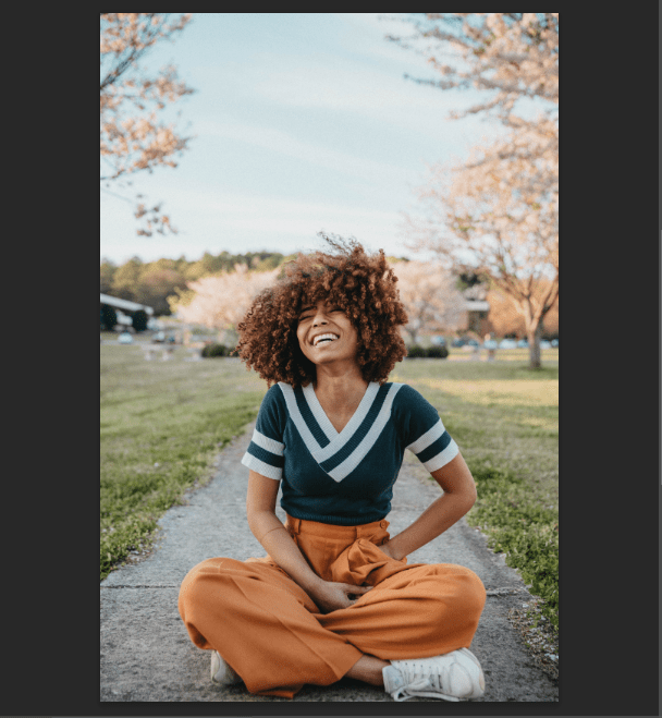
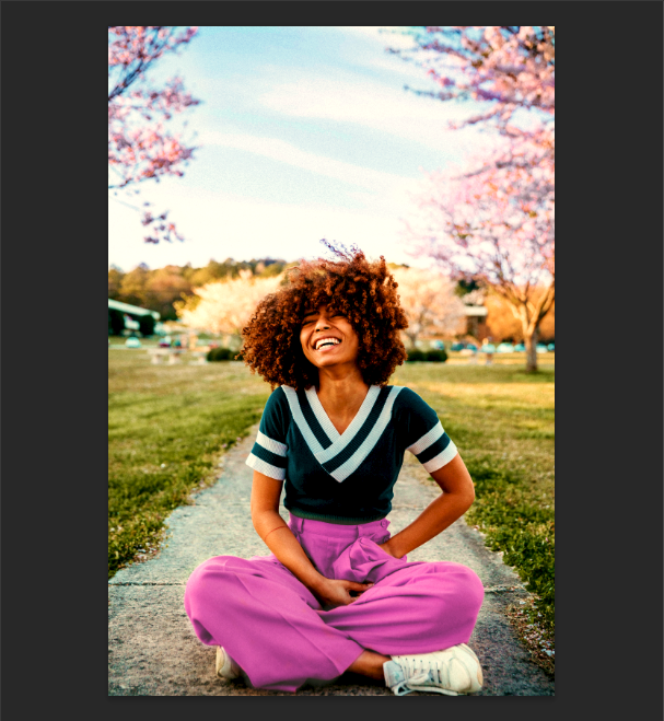
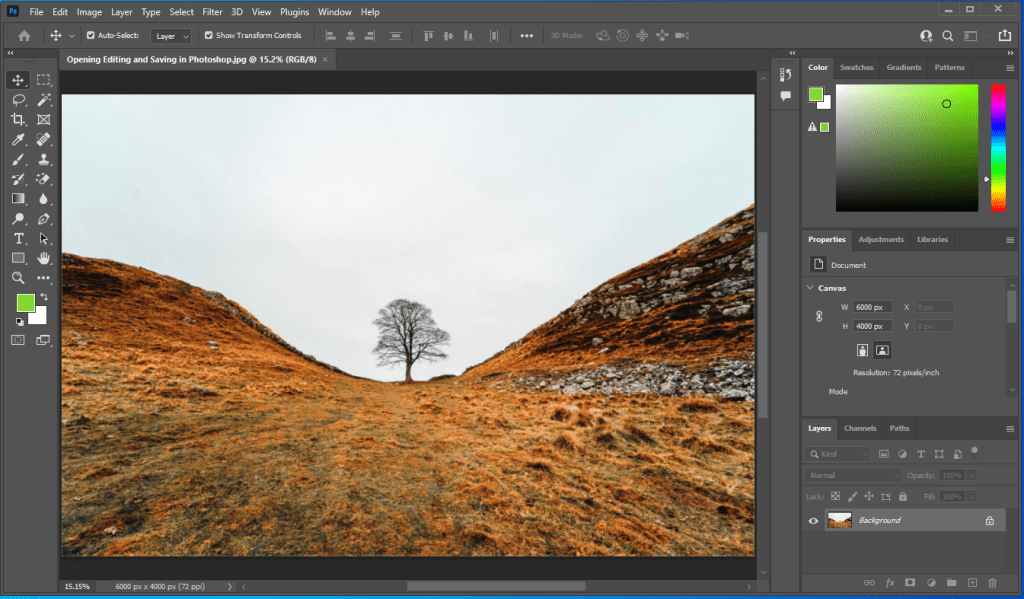
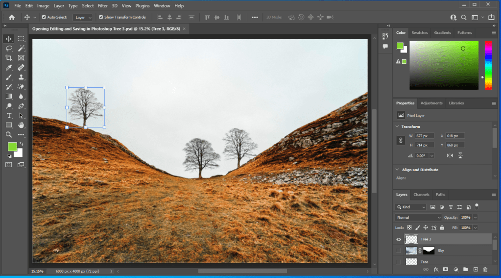
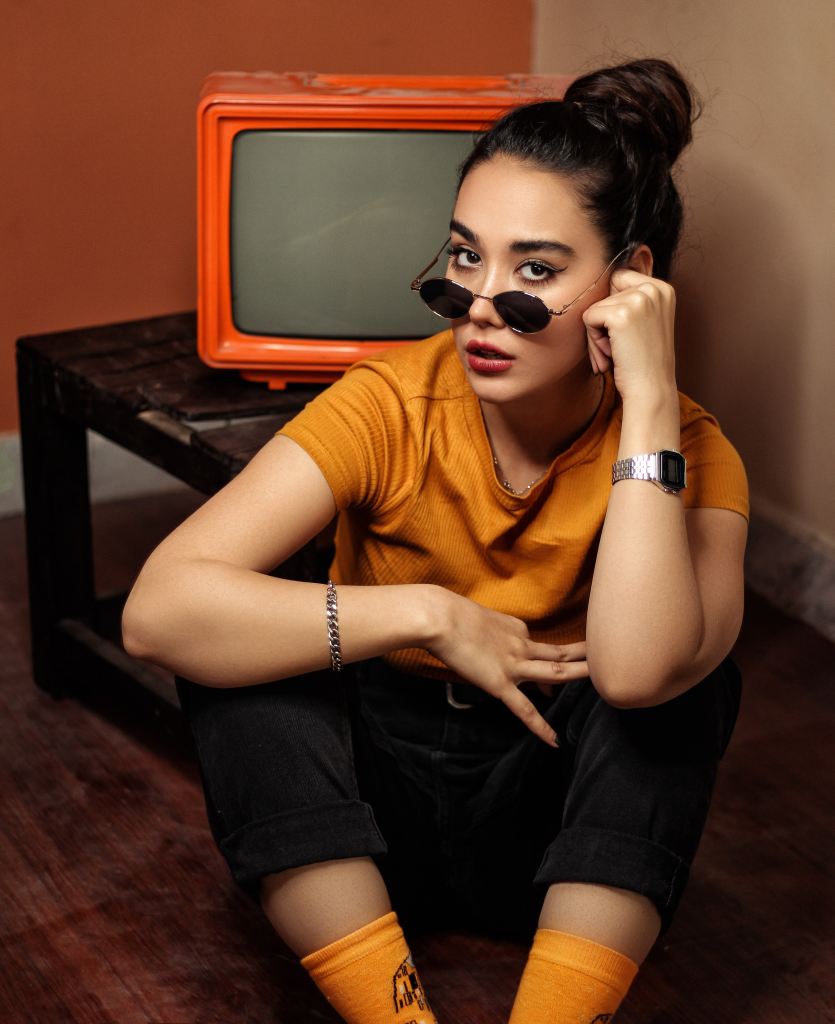
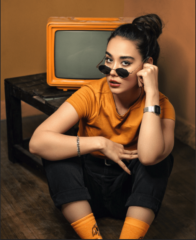
I enjoyed the project of using both the Hue/Saturation and the Color Balance. I can use them to change into any color I want on my image. You can change color on the entire image (including the skin tone and the clothing) on Hue/Saturation layer, but I only want the background color to change. I use the Eyedrop tool select the red-orange of the TV and notice that color change at the bottom of the layer, between them, there’s thick, gray lines which indicate the shifting of color when click. Moving affected the color of the person, so I make the gray lines thinner to show less effect. I added another and clicked on “Colorize”. I move and drag to give the best color shown on the person’s clothing. The skin tone looked unnatural, so I created a layer mask and made it invisible using the paint brush tool, making use the black is above the white (bottom of the Tool Bar). Something interesting I’ve did using the Spot Healing Brush tool was making the line look invisible. I can use it if I don’t want the object looking too conspicuous. The picture looks beautiful, except the shading and brightness needed to be added, the shading and highlights using the Color Balance. Changing colors in the “Shadows” tone makes the image a little too dark, so I used “Midtones”. I also added a bit of red, yellow and very little green highlights as well.

Day 6: Levels & Curves

Before
Finish

This project was easy and fun to do. I had no difficulties, but a some doubts about the Gradient tool. The color I was searching for wasn’t available, but I chose the best one that I can find, it worked out without trouble. Interesting to know about that the Curves and Levels are quite similar because they both consist of adjusting the dark and brightness of the image, and choosing the available color within it. For example, when I wish to add the image looking a little red from left to the right, I click on the RGB layer and chose “Red”, and I adjust the brightness using the input layer while the layer, “Levels 1” is selected (I can do it on curves as well). I move left to add red, but it’ll add a different color if I go to the other direction. The output layer is the same, except it’s the opposite. Once I pick the brightness of the Red I saw fit, I use the Gradient tool to select the direction I want the brightness to be placed. I did put some green on the image, but I didn’t use the Gradient tool, I used the little Hand tool on the top left corner, where above on all the other tools in the Curves Layer. I can choose whatever area I want the image to be green, I go up to brighten it, and down to darken it.

Day 5: Selections

Before
After

The Selection Project was pretty fun, it brought back memories as if I was working on some of the first projects in Principles of A/V during the part when I was using the Lasso tool. More importantly, I haven’t really learned all the layers of this project, but I’ve learned the Curves Layer uses to bright or darken the text, or any other specific object of the image. I can change it into whatever color I saw fit. Also for the Gradient tool, it blends colors and changes into a text, background or anything from light to dark, or dark to light. It varies from which direction I click – left to right, top to bottom, it doesn’t matter. If I wanted to choose any color, I just go to the Gradient layer on the layers panel and choose it. The difficult part of the project was moving the text “Selections Are Great”, because it was above all of the layers, that I accidentally moved the image around. It did not go the way as I expected. This made a little stressed, so I needed to rewind the video to go back and set things right. I should move the layers to the bottom the next time I wanted to move an object or text without accidentally moving the background images.

Day 4: Adjustment Layers

Here’s my image of the Adjustment Layer project. I assumed this project would be unusual at first because something that I never used on Photoshop before, but going through, I thought it was amazing. I can change my image into any different colors depending on what layer I choose or select. I can also adjust the brightness using the opacity or other tools on different layers. I probably won’t remember all of the layers, but I think they’re really cool and useful for changing images into a beautiful and a bright one.

Day 3: Layers and Masks

In this project, I’ve learned how non-destructive the masking tool was compared to the eraser tool. Whenever I go to the paint tool and color the object I can always bring it back up without any limits. I make sure to look at the color area at the bottom of the tool selection, if white is above black I can turn the object visible, and if black is above white I can turn the object invisible. Instead of using the switch arrows (right top corner of the color codes), I press X key to switch colors. With this, I can put certain objects over texts, and to make sure the entire part of it is visible. I love to color and use the paint tool. It’s fun and reduces stressfulness. This project was fun and amazing.

Day 2: Opening, Editing, & Saving in Photoshop

Here’s my two images on Day 2 of the 30-day Photoshop project. I was first stressed because I had doubts if I could pass, but like always, I made sure that I followed every step and if something goes wrong, go back and fix it. The project was pretty fun, some of the things that I’ve learned was when the users press F key, space of the bottom, top right corner, and around the bottom left side of screen, will clear up. It can be done the second time and as a result everything around the corner is clear except the image. Users can also move the tab of the image outside of the main screen and resize it. You can put under and over the other images if they wish. Just put it back around the top of the tool selection if you prefer working on the screen normally. Despite feeling stressed, I liked the project and I can start getting used to working on Photoshop after a while of not using it.

Illustrator Batman Art

It took me a while to this done. What I did learn is if I try to select to rise the shape I colored using the paint tool, it doesn’t work on all of the aspects of the paint. More importantly, I didn’t think about it before resizing Batman after I drew him, and it took me some time to fix the artwork before I colored the rest of his body. I enjoyed the project so far but if I wish to finish it faster, I would of think straight and carefully before moving onto the next step. I’ll try not to get carried away next time.

Powerpuff Girls Artwork

This is my artwork of the Powerpuff Girls on Illustrator. At the very beginning, I started to create oval shapes colored in peach that represents the girls’ heads. Then I also created circles for Bubble’s eyes, adjust the sizes of them and colored of them in black and the other one in blue. I made a copy for Buttercup’s and Blossom’s as well, changed their eye color in pink (for Blossom) and green (for Buttercup). It turned out to be a little complicated assembling the heads, so I focused on doing the body first. When done, I did the hair using the pen tool. Something interesting I’ve learned is instead of adjusting the lines of the pen tool make the color position itself correctly, I used the brush tool to color inside of the shape itself. This only works for the Stroke Color. I did this for Buttercup’s and Blossom’s hair (and her red bow), and all of the girls’ hands. I took me a while to get done, but I made sure I sorted things out right. I also maximized the stroke lines of the girls’ body (also some parts of their eyes), as a thought they were too thin for 1pt stroke. I rotated their eyes multiple times when drawing their faces. This artwork was a very fun and I experienced in doing something a little different. I probably will be doing the same thing with the batman version as well.

Batman Artwork Practice Summary

This is my artwork of Batman. I initially drew the character himself because it was something I was focused on, but I also added the lettering to because it turned out that the artwork didn’t look accurate without it. The lettering wasn’t very difficult so I didn’t took much time on it. When it’s all done, that pretty much sums it up. I love my artwork how it is. I’m looking forward into practicing some cartoon characters I want to draw in the near future. Happy practicing!

Graphic Design 2 Summary: Superwoman Artwork Project

This my image of the artwork I did. I started the lettering because I thought doing it would really fun, but it took sometime to do it because I wanted to make sure the letters were accurate and positioned correctly. I initially drew the basic shape and added details when ready. The lines were a little difficult – I just had to line them correctly to be sure that they do not looked like there curved. When all the details have been added, I traced them in black ink, mostly using a ruler to prevent from messing it up. On Superwoman, I did basically the same thing, except that I didn’t use the ruler that much. On the pants, her boots, and part of her cape (left side of her pants/below her right arm), there was shading so I initially focused on the highlights first, then added the shade using the black pen. In both drawings, I waited for the ink to dry until it ready to erase the pencil lines to add coloring and, I use my phone to search up the image to search up the image I wanted to draw.

Design a site like this with WordPress.com
Get started