Day 14: Blend If in Photoshop

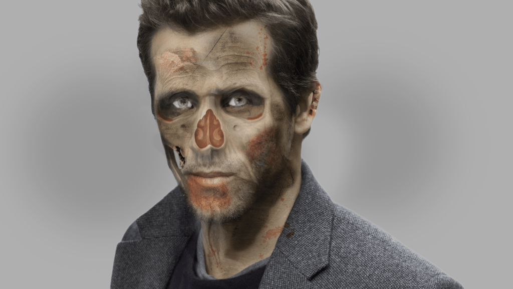
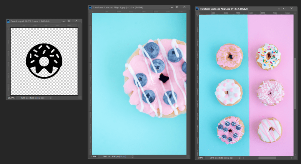
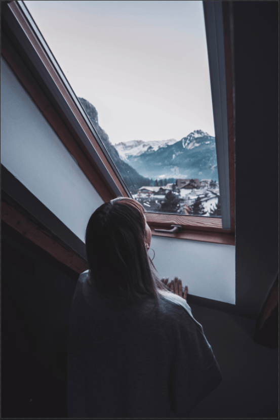
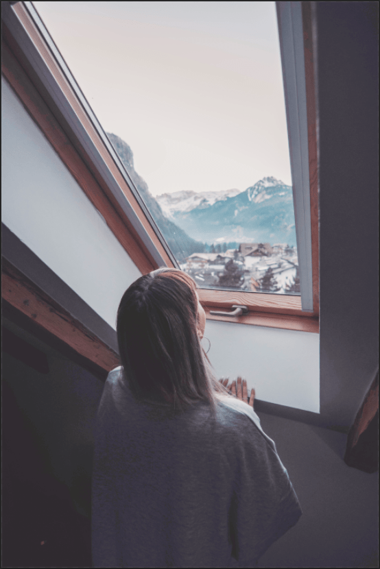
Blending is starting to become one of my favorite things thanks to this part of the project. Blending is not just useful for using a variety of adjustment layers to turn your picture into more a refined image, it also deals with making them to make your image not too dark and not too light. We shadows to light up, but not the highlights. I used Curves layer for this, and the most interesting part is at the beginning – Blending Options – where you can move “This Layer” and the “Underlying Layer”. I did it after putting black on top, white in the middle, & red in the bottom. When you move the two layers, the black arrow (on the left) to the left, the black and red disappears to a part the white is visible. The white arrow (on the right) the process is the same except it makes the white and red invisible to a part the black visible. Underlaying Layer does the same thing but in a different way. The reason why this was done in the first place was just a demonstration to how Blend If works. Happy practicing!

Day 13: Edit Non-Destructively with Smart Objects

There some interesting things I’ve learned in this project. Smart Guides are used for making your image non-destructive. I duplicated my background image and converted the copy image into a Smart Object (right-click on Layer and click on “Convert to Smart Object”) and named it “smart”. There an icon on the bottom-right of the Layer’s image. For the other copy I named it “regular” because there’s no icon on the Layer’s image. I hold shift to select both layers and made them small, then used Transform (Ctrl + T) to make them big again. It didn’t seem to have any affect, but the instructor shows the regular image starts to lose quality as you resize it from large to small and from small to big. The “smart” image, however, didn’t lose any quality because it’s a smart object. That’s why smart objects are very important for images and layers to become non-destructive when you want to resize them. After I resized and placed the other three images, also the white lines to separate them (Rectangle Marquee and Ctrl + J to duplicate the other two), I sharpened the image to show some details. Filter > Sharpen > Unsharp Mask to do this process, and adjust the Amount and Radius to see how I want to see fit. If it’s too much, I can adjust it again. If I look at my Layer, on the right side there is an icon with two circles. I hold “Alt” and move it to the other three layers for the three images, so it has the same sharpening and I won’t have to do the whole process again.

Thankful Turkey Illustrator Project

This project is familiar because I’ve done it in my second year of high school, but some images I used in today’s one are little different from the one I did in the previous one. I used Adobe Illustrator for the turkey on the bottom right. I was happy to be back on it for just a bit because Illustrator was my favorite Adobe thing to use. There are few things I remember: How to create shapes and place them, how to use the fill color and the stroke color, using reflect to make the parts of the image look symmetrical (like I did on the Turkey’s eyes), grouping & ungrouping objects. There are also other things/methods I don’t remember or haven’t learned, but what I did learn was to use the align tools (in the layers panel) to center the parts of my artwork or just the entire thing. When I finished my turkey, I went to “File”, exported it, and went photoshop to create the background image. I got completely lost on this section, so I skipped erasing the white parts of the Autumn leaves and placed the background image and adjust it. I used the type tool to type in some words. I adjusted it again and colored it in brown. The photoshop process was a bit sloppy at first, and turned out different than I expected, but overall I think the image is good. It’s looks very colorful and pretty.

Day 12: Liquify Tool

I never knew how to use the Liquify Tool at first, but thanks to this project I finally know how it works. The Liquify Tool is for moving different parts of the image into a way users can do to see how their image want to see fit. For instance, if some areas if the picture look odd, just use liquify to adjust them into more refined one. Before using Liquify on each layer, it’s very important to right-click and select “Convert to Smart Object” because after you click “Ok” using the Liquify Tool after adjusting the parts of the picture, you’ll have a hard time fixing everything up if you click on & off on the Layer where it says, “Liquify” (under the main layer you used the Liquify tool). When I use Liquify Tool, the whole image is placed in the middle, the tools are on the left, and the adjustments are on the right. I make my image is visible on the Liquify because if it wasn’t I wouldn’t be able to adjust the image properly.

Day 11: Adding Text to a Photo

This project was kind of like the Transform, Scale, Rotate, and Align Project. One thing stood was put the text behind then picture. I use the Magic Wand tool to select the part of the spacing, not the subject that I want (make sure to hold shift), turn the text’s invisibility on, and add a layer mask. Part of the text is erased from the subject so unchain the layer masks, which in between, to prevent it from happening. That way I can move the text without any part been erased. I also learned that I can put color on behind the texts. Doing this, I add the Solid Color font (which adds the Color Fill layer), select the color, and invert the layer mask. When that’s done, select the area using the Marquee tool, then press Shift + Backspace and add “White” to the “Contents” layer to fill the area black. Make sure to put the Color Fill layer under the type layers. Feel free to change the color if you don’t like it. It’s good to reduce the opacity a bit to see the background image. I made sure to put the texts in the center of the brown rectangle to look nice using the Align edges at the top. I grouped the texts so I could Align them at the same time.

Ryan Zombie/Skeleton Project

I should have posted this earlier, but here it is. This is before my skeleton project of which I created in my own of the picture myself. I did the same process, but compared to my own image, I didn’t have much difficulties when creating this one because I was guided, and I was able to resize the meat to put in the ear and the left cheek. Notice how the blood and the meat look different from my own project. But the background color are both the same. Both projects were created to celebrate Halloween. I can now imagine how I can create my own using Adobe Illustrator, but looking completely different from this skeleton one.

Day 10: Crop & Resize

This was one of the easiest things to learn in Photoshop. Cropping and resizing the image is a fundamental thing, but it makes a lot of difference. I click on the image using the Crop tool, and if I look at the top of the screen, there’s a box titled “Ratio”, which I click to change the height and width of the image. For instance, if I pick 4 : 5 (8 : 10), the size of the image will change for that is meant for the ratio I select. 4 : 5 (8 : 10) will make the image size larger in height but shorter in widths. All of the ratios are pretty much the same, except the 1 : 1 (square) makes the image having the same width & height. Users could also type the ratio in the two boxes which have the right & left arrow in between them. It’s adjacent to the Ratio box on the right. The “Content-Aware” Crop was my favorite part of the project. When it’s checked, it allows me to extend the image only to make it more realistic, but also to make it more refined and add more information. With the Crop tool selected, I extended the top of the image and clicked on the check mark at the top. It took time so I waited for a bit until it’s done. I also did with the right & left side as well, and I was amazed how my image turned out it be. It was incredible. I’ve wanted to save both images, the start and the finished one, but they were basically the same so I couldn’t.

Day 9: Brush Tool

Start
Finish

This is my favorite project of the 30 days of Photoshop. I can’t really think of any other explanation, but I’m just amazed about how I turned my picture into a very refined one. Just like what the instructor said, the Brush tool is my favorite tool. But lets get down to business – when I was using the Brush tool, the opacity is not only available – the flow also appears on the top of the screen next to it. This tool helps to soften the color of the Brush tool, more than it does when lowering the opacity. If I can turn to low as 5%, it’d be soft like when I’m using the gradient tool. I used very low flow when brightening and darkening the parts of the image, and used the curves layer in both processes. Adding the fogs on the mountains around the top image was the best part. I don’t remember the whole process, but I learned that you can actually take the shape of anything, like a cloud, on the Brush tool. I can make any adjustments if wanted, just go to the Brush Settings at the top-left at the panel on the right (where you make all different adjustments on variety of layers) and adjust the Shape Dynamics, Scattering, Transfer, etc. I only used the 3 tools I just mentioned. And then I clicked “New Brush Preset” by on the menu icon on the right and named the new brush “PHLEARN Cloud”. With this, I can go to the Brush tool settings and notice the brush tool I just created is in there. I used it to make fogs on the mountains (around the top of the image). With that being said, I enjoyed this project very much and I’m happy to know that any users can create their own brush style and place it into the brush settings.

Halloween: Skeleton Project

This is my Zombie/Skeleton project. I’m not a fan of zombies at all, but so far I enjoyed the project. Most parts of it were easy but some of the difficulties that I came across was putting the meat at my left cheek. It took me some time to adjust the image and place it because I wasn’t quite sure where I want it to be. Also, I would of colored the blood and the meat better after using the vibrance layer to make my skin look gray because I notice there some skin color areas around my image. Another thing, I would of made the background color a lot better at the very beginning of the project because like I said, there are some parts that I don’t want. Despite the difficulties, I like my picture so far and I finally can get back to my 30 days of Photoshop assignment after a while of doing this project.

Day 8: Scale, Rotate & Align

Start
Finish

There are a lot interesting things that I’ve learned from this Project. Auto-Select (top-left corner) allows me to deselect an object and pick another one when its checked. However, if the Auto-Select unchecked, it restricts me from clicking any object; I must rely on the layers panel to select one that is meant for the certain layer. When I use transform (Ctrl + T) for the object, certain options will appear on the top of the screen. The target point at the center of the image represents the center of rotation when I rotate the object. When I move the target point in different areas of the image, the image will rotate clockwise or counterclockwise but the center area will be different. Also, resizing the object with both width and height is available if the chain between them is locked. If it’s unlocked, however, I can only resize the image with height or width individually. One thing I never knew was cropping the image allowing it to provide space after placing multiple images altogether. I press C to use the crop tool, and after selecting a size, a large pixel space will appear on the sides, and this is very important: On the top of the screen, there is “Delete Cropped Pixels”. I want to make it is unchecked, because if it’s checked, it’s not recommended – and it’ll delete the personal space that’s needed. When the image is perfectly cropped, I clicked on the Check Mark (on top of the screen, but at the right) to confirm it done. I might forget how to use a crop video, but I’m sure I would look it up anytime if necessary.

Design a site like this with WordPress.com
Get started