AI Project: A Minimal Vector Portrait

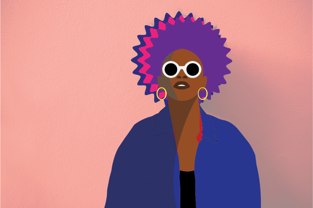
Here’s my Vector Portrait I made. This took a bit of time, but I really had fun working on it. My favorite part was the Shade part. It was interesting to know that in many artworks, including in cartoon characters, have shades on each of their sides to change the color tone depending which direction the characters (or other objects) face. To create one, decide any part of your artwork your want to add a shade in. With the fill color in black, use the Curvature Tool to draw any shape and fill above the object. Go to the Properties panel and lower the Opacity to 50% (or lower if you want). And there, you have your shading. I also enjoyed knowing how the Curvature Tool works, and it’s better than using the regular Pen Tool. On the body and the neck of the Vector Portrait I used the points to enlarge the different shapes so the fill color of it covers the space between them. The body looks a bit weird, but overall, I think it suits the portrait.

Al Chapter 6: Variwidths Mask

I’ve finally learned that the Width tool is used to adjust the thickness of the line stroke. You can play with it to see how it works, then if you’re happy with the stroke you can leave it as you like. I also learned the Profile is what functions the different shapes and styles of the stroke when the Width tool is used. It’s at the very bottom of the Stroke panel. It’s shown a straight line with “uniform” on the right at first, but when I select different styles, it changes the shape of the stroke. The Profile is also located at the top of the screen in the Width panel. You may add different types of Brushes (next to Profile) if you wish.

Al Chapter 6: Arrowheads

I made some updates on this image based on what I’ve just learned. I like the colors and everything except the arrows – There were a lot of dotted lines so I opened the Stroke panel and adjusted the dashed lines. On “Dash” (the one on the very left), I put 35pt. As you can see, I added the up & down arrows as well, because if you look right below the “Dashed Lines” section, there’s “Arrowheads”, which allows to put any different types of arrows on the artboard. You can adjust both sides differently or in a same style whoever you want. I selected “Arrow 2” for both sides. With everything finished, I finally deselect everything and look at the entire artboard. The dotted sides look way better than they were before. If you love arrows and dotted lines, you can imagine creating an artwork that has many of them with different dashes, shapes, and styles.

Al Chapter 6: make Brushes

I only learned a bit in the section, but there are some unusual things I’ve seen. After opening the “Brushes” from clicking Window above the screen, and putting next to the other panels on the left , I’ll notice there’s a box with a plus sign at the very bottom. When I click it, it pops up a window where you can adjust you brush into a different color or style to how I want to see the stoke itself see fit. You can name the brush and adds to the Brush panel if you click Ok. The name will appear you I hover my mouse over it. I can select different letters or strokes and put the stroke of the brush if I wanted. I did the same thing for the color brush (pink, yellow, blue), but the color went black and white so I clicked to the Stroke panel and adjusted the color to light green.

Al Chapter 6: Strokes

I’ve learned something new about the strokes in Illustrator. When the curves are selected, I can change the style using Align Strokes – whether Align Stroke to Center, Inside, or Outside. I liked the Inside style, but it made the curves too pointy so I chose Center instead. For the heart at the top center of the skeleton, I adjusted the second line. To make it dashed, I checked (or clicked) “Dashed Line” and it opens up a section of different types of “dash” & “gap”. Here, I can adjust the gaps and the dotted lines. On the very left “dash”, I put 10pt and 6pt in the “gap” on the next. It’s a very interesting process for making the shapes very accurate and neat, also making sure that the spacing match to the others.

Al Chapter 4: free Transform and puppet warp

I’ve something interesting in this part. By pressing only just the “E” key, there are a variety of Free Transform tools that can be used. I used the “Perspective Distort” and the “Free Distort” tool. There differences between them – the Perspective Distort changes the selected point of the fish (or any image) into a smaller or bigger size depending on what direction I click (top-left, top-right). When I move the tail into a smaller size, for example, the fish looks like its moving towards something. The Free Distort tool moves the image from the up & down area of the fish. Moving the top part of the fish in a smaller size and the bottom part a little big. It somehow made the fish’s head slightly smaller and his body a little wider. These tools are extremely useful, and I can use them anytime if I had a project similar to this one.

AI Chapter 4: Transform Each

I’m amazed to know that you can transform all objects at the same time, even through they cannot rotate or change size in the same way. For instance, notice how the images are resized and rotated differently. I selected all the objects and I used the Transform tool to change them. I’m afraid I had forgotten the key (press Enter key at the same time) that pops up the table to change the height & width and the rotation.

Al Chapter 4: Transform Again

Until this part of the project I didn’t know you can scale and image to a larger size. It’s not only amazing, but very useful and convenient. I press the “S” and the “Enter” key at the same time to scale a single image. You can change it’s rotation, Uniform and Non-Uniform. If the scaling doesn’t look right to can change to however you’d like. Scaling is useful for making movie posters or creating you own artwork.

Design a site like this with WordPress.com
Get started