This image is originally colored and turned into black and white. I went to Image> Adjustments> Threshold. I typed in 128 in the box and clicked Ok. It was all I had to do. I didn’t learn this skill, but it’s an easy process of making your entire image from turning from color to black & white.
For this project, I added the a new pattern and click one with the “Bevel and Emboss” selected. On the “Text Fill”, I double-clicked the layer and made a few adjustments in the Drop Shadow section. I put the Opacity to 85%, Distance to 7, and the Blend Mode to Normal. I lowered the fill to 48% to see how different the text looks. Making adjustments in photoshop (especially this one) is not very easy to learn, but I understand it’s useful to create different texts if users do not want them to look and entirely a plain color, because it would be dull and boring sometimes.
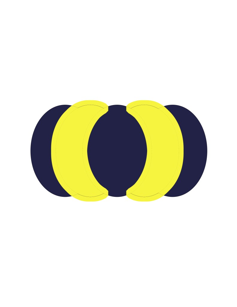
There was something interesting about the Magic Wand tool. I extended it to 50% (I don’t remember how) and added a new color to both shapes I’ve selected using the Paint Bucket tool. It was unusual because I didn’t know there was that sort of technique in Photoshop and thought you could only do it in Illustrator, except it doesn’t have the Magic Wand tool.
From these two projects I’ve learned a little bit about how the Crop tool works. It be used to extend the background image but not the object. When extending, I hold Alt while moving both sides. I moved the top part as well. To make sure that both top and sides aren’t moving at the same time, click on the “Clear” button at the top to prevent that from happening. The Crop tool is very useful thing to use.
I took me weeks to complete this project. At first, I was unsure because I didn’t know where to place to triangle around the cat’s face, but I did the best I as could. I also did added the some with the mouth and the nose. When done, I selected the entire thing, clicked on “Divide” in the Pathfinder panel, and used the Eyedropper tool when I selected each triangle (by clicking the circles on the right of the Layer panels). Before this method, I used the Paintbrush because I thought it would be easier, but yet will take a lot of time (which I knew). So the I Eyedropper tool is better when doing projects for this and Live Paint Bucket tool is also good when you’re coloring a shape or an object in Illustrator. Happy Practicing.
I’ve really liked this project because it gave me a knowledge how to color a object or shape by using the Live Paint Bucket tool. It was very efficient. I love this tool because I really love to color. It’s not just about coloring – when you drag hover your mouse onto the object using the tool, the strokes are highlighted in red. Just zoom in to select the stroke individually, and put “no stroke” or type in 0 pt if you don’t want any to be visible.
Here’s my artwork of a rose. I’ve already learned how to use the Live Paint Bucket tool, so I selected the entire rose and use it to color different areas of it. I didn’t want to the rose to look entirely red so I chose different colors like magenta and dark pink. I used different greens on the leaves as well. After I finished I added some little stars next to it, because it reminded me of a Disney movie, Beauty and the Beast. The artwork looks beautiful. It’s better than using the Brush tool when doing this because it doesn’t take a lot of time.
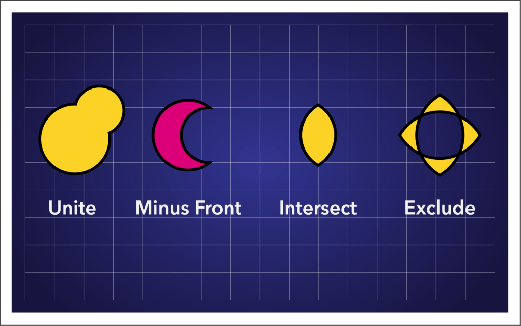
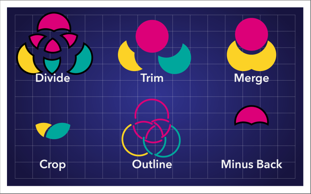
This project was pretty simple – I had to test one of the Pathfinder tools to see how it works because all different types of them are different. There’s Outline, Trim, Merge, Crop, Outline, and Minus Bac for the bottom part and Unite, Minus Front, Intersect, and Exclude for the top part. The interesting part was after you click a pathfinder, any different type with the object selected (Divide for example), and double click the object will bring up the isolation mode. When on, you can play around with it – and you’ll know how it works. Just double-click anywhere in the artboard to get out the isolation mode.
I’m not very good at using the Shape Builder tool because I’m somewhat confused at seeing how it works. But the thing I’ve learned about is that certain lines and shapes of the object can disappear when you drag different lines of the shape. It’s very handy to get rid of undesired parts of an object or shape. Say if you want to get rid of a circle in a magnifying glass, use your shape builder tool and drag to get rid of it. It takes practice, but if it doesn’t work out property, just rely on your own knowledge and methods to change an object or create a new artwork.
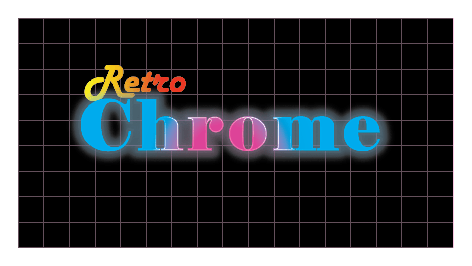
I was quite sloppy of this project and had some difficulty on navigating some of the tools, so I couldn’t add the background until the end. But things got easier when I adjusted the Gradient color fills of what I used in the Appearance panel. Even certain things didn’t work out the way I expected, I kept on trying the best as I can. I wanted the “Retro” text to be colored in orange because I didn’t want too much pink on my artwork. Also, I’ve actually learned that reducing the opacity on the fill colors on the Appearance panel make the text look brighter in a dark background.