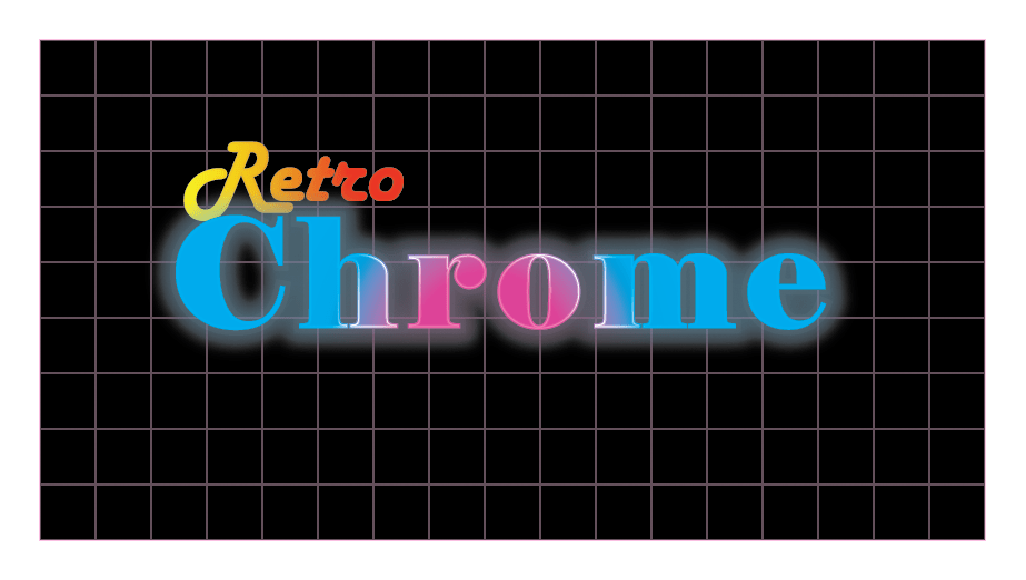
I was quite sloppy of this project and had some difficulty on navigating some of the tools, so I couldn’t add the background until the end. But things got easier when I adjusted the Gradient color fills of what I used in the Appearance panel. Even certain things didn’t work out the way I expected, I kept on trying the best as I can. I wanted the “Retro” text to be colored in orange because I didn’t want too much pink on my artwork. Also, I’ve actually learned that reducing the opacity on the fill colors on the Appearance panel make the text look brighter in a dark background.
